|
def detrend_dim(da, dim, deg=1):
"""detrend along a single dimension.""" # calculate polynomial coefficients p = da.polyfit(dim=dim, deg=deg, skipna=False) # evaluate trend fit = xr.polyval(da[dim], p.polyfit_coefficients) # remove the trend return da - fit Courtesy: Ryan Abernathy's tweet Example: SSTa_detrended = detrend_dim (SSTa, dim = 'time')
0 Comments
Python Xarray module provides a built-in function to group together months of a specific season and calculate seasonal means. This is straightforward for most seasons, but calculating the DJF mean (December-January-February) requires additional effort, as it spans months from two consecutive years (e.g., December of 1989 and January-February of 1990). Simply taking the annual mean of the DJF months would yield erroneous results, as it would calculate seasonal means for each individual year. Correctly calculating DJF seasonal means can be achieved using various methods. Below, I will demonstrate three different approaches. DJF seasonal mean: Here, I am briefly explaining the Method 1 only. Method 2 and 3 should be self-explanatory. Method 1 Step 1: Select only the DJF months first. Rest will be masked out with nan values. Step 2: Apply 3-months rolling mean to calculate DJF mean values. Only the January values will be available. Why?? (Think carefully!!) Step3: Group by years. Annual mean doesn't impact at all since there is only January value in each year. Note that, the first year will have nan value. 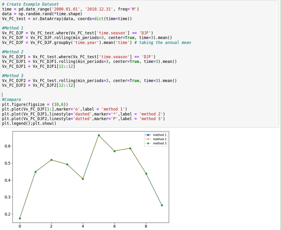 MAM/JJA/SON:
Rest of the seasons can be calculated in a single line. Here is the example of SON. Vx_FC_SON = Vx_FC.sel(time=Vx_FC['time.season']=='SON').groupby('time.year').mean('time') I am pretty sure that you might have come across to a point where you made changes that caused troubles in many forms. I personally faced it a lot and a recent one that I encountered was that I updated conda which eventually became incompatible with numerous python packages and modules. It was a pain to find and solve issues for each packages. The easiest solution would be rolling back to the previous version of the environment. Luckily, rolling back to the previous conda version is as easy as pie.
In order to see versions and recent changes in the environment, use the command: 'conda list --revisions' You'll see outputs with revision name like (rev 1, rev 2, etc) If you identify any versions of your pervious environment from the date that you want to activate again, you will just need the revision number of that version and viola! Command to roll back to older version: 'conda install --revision N (where N is the revision number)' Hope it helps! In atmospheric science, we often need to deal with masked data type. Rather than writing a new blog on my own, I find one resource very helpful and applied. There are definitely numerous sources of references regarding the masked array.
LinK: https://currents.soest.hawaii.edu/ocn_data_analysis/_static/masked_arrays.html 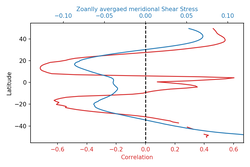 We often need to create duel axis plot for comparing result with two variables. We can produce these plots using python matplotlib subplot and Axes.twinx(self)¶functions. Below, I demonstrate such a python code snippet to draw a duel axis plot having their axes aligned at x =0 or y=0 location (or wherever you like it to align). For the alignment, I've to using a user defined function. def align_xaxis(ax1, v1, ax2, v2): """adjust ax2 xlimit so that v2 in ax2 is aligned to v1 in ax1""" x1, _ = ax1.transData.transform((v1, 0)) x2, _ = ax2.transData.transform((v2, 0)) inv = ax2.transData.inverted() dx, _ = inv.transform((0, 0)) - inv.transform((x1-x2, 0)) minx, maxx = ax2.get_xlim() ax2.set_xlim(minx+dx, maxx+dx) fig, ax1 = plt.subplots() color = 'tab:red' ax1.set_xlabel('Correlation', color = color) ax1.set_ylabel('Latitude') ax1.plot(corr_xavg,lat_new,color=color) ax1.tick_params(axis='x', labelcolor=color) # ax2 = ax1.twinx() # instantiate a second axes that shares the same x-axis ax2 = ax1.twiny() # instantiate a second axes that shares the same y-axis color = 'tab:blue' ax2.set_xlabel('Zoanlly avergaed meridional Shear Stress', color=color) # we already handled the x-label with ax1 ax2.plot(tauxp_tavg_xavg,lat_new, color=color) ax2.tick_params(axis='x', labelcolor=color) align_xaxis(ax1,0,ax2, 0) fig.tight_layout() # otherwise the right y-label is slightly clipped plt.axvline(0.0, -50, 50, color='k', linestyle='--') # draw a vertical line at x = 0 plt.show() For the y-axis alignment, use this function: def align_yaxis(ax1, v1, ax2, v2): """adjust ax2 ylimit so that v2 in ax2 is aligned to v1 in ax1""" _, y1 = ax1.transData.transform((0, v1)) _, y2 = ax2.transData.transform((0, v2)) inv = ax2.transData.inverted() _, dy = inv.transform((0, 0)) - inv.transform((0, y1-y2)) miny, maxy = ax2.get_ylim() ax2.set_ylim(miny+dy, maxy+dy) Acknowledgement: This link helped to create the axis alignment function. |
AuthorMahdi Hasan Archives
September 2023
Categories |
 RSS Feed
